Software systems produce vast amounts of unstructured information. Hidden within these swaths of data are critical insights that could be invaluable for you as a decision-maker.
However, unlocking these insights isn’t straightforward. A modern, powerful approach to knowledge extraction combines large language models (LLMs) with knowledge graphs (KGs). While LLMs are great for understanding and generating human language, KGs excel at structuring and querying complex data relationships.
Together, these AI tools built using a combination of LLMs and KGs can create systems capable of sophisticated insights—a notable example being the GraphRAG system, where a knowledge graph enhances the context for an LLM, leading to more relevant and accurate responses.

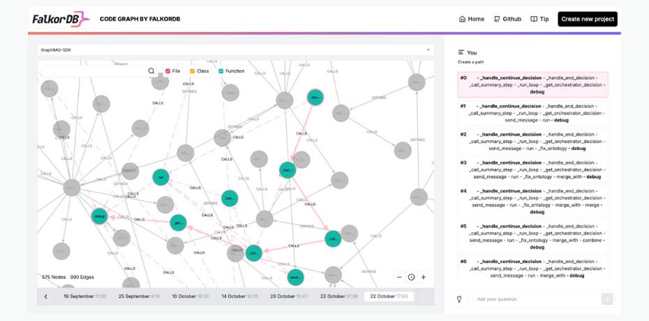
One of the best things about knowledge graphs is that you can visualize them. This visualization is a game-changer when it comes to understanding complex relationships and spotting patterns in your data. Using tools like the FalkorDB browser or code graph, you can explore the connections between concepts, uncover valuable insights, and refine your knowledge modeling approach.
In this article, we’ll dive deeper into knowledge graph visualization, exploring its applications, the benefits it offers, and the challenges it presents. You’ll see first-hand how visualization can help you model your data more effectively.
How a Knowledge Graph Works
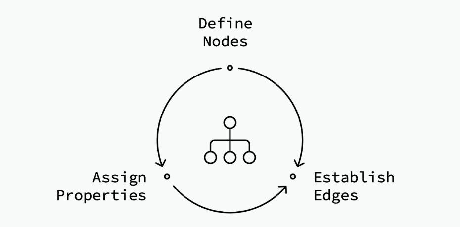
Knowledge graphs represent entities or concepts in data as nodes, and the relationships between them as edges. Technically, a graph edge connects a “subject” node and an “object” node, and is known as a “predicate”. Most knowledge graphs are based on this Subject-Object-Predicate (SOP) or Node/Edge model:
- Nodes: These represent entities such as objects, people, places, things, or even, functions or modules in code.
- Edges: These depict the interconnections between different nodes.
- Properties: These are attribute-value pairs that can be attached to nodes and edges to provide more detailed information. For example, nodes representing people can have properties like name, age, and location.

Why Visualize Knowledge Graphs?
Visualizing a knowledge graph transforms disconnected facts, like text in a document, into a dynamic knowledge map. It gives you a bird’s-eye view of the entire information system hidden within your data, while also allowing you to explore it through a specific lens.
With knowledge graph visualizations, you can uncover not only the obvious connections but also hidden relationships that might otherwise go unnoticed. For instance, you might discover that a prominent customer is also an investor or that an overlooked product drives significant sales for the company.

Here are key factors that make these visualizations effective:
- Interactivity: Modern knowledge graph visualization tools allow users to zoom, pan, and expand/collapse nodes, enabling them to focus on relevant areas while filtering out unnecessary information, making insights easier to find.
- Contextual Understanding: Visualizing nodes and edges provides an immediate grasp of relationships between data points, helping users intuitively understand how entities are connected.
- Complex Relationship Mapping: Knowledge graphs can display intricate, non-linear relationships, making it easier to spot indirect links and clusters that traditional methods might miss.
- Scalability: Knowledge graphs handle large data sets without overwhelming users, thanks to features like filtering and clustering, maintaining clarity as they grow.
- Multidimensional Insights: Knowledge graphs support multiple attributes and complex relationships, providing deeper insights than simple tables or hierarchies.
How Do You Visualize Knowledge with Graphs?
To effectively visualize knowledge with graphs, you’ll need to follow a structured series of steps to extract, organize, and represent complex relationships in a way that’s both meaningful and useful.
Knowledge graph visualization involves several key stages, from data ingestion to graph rendering.
Let’s break down the process with an example:
Data Retrieval and Selection
The first step is to retrieve and select relevant data from various sources. You might be working with unstructured or semi-structured information, like text documents, databases, or APIs. Your goal here is to extract the entities and relationships that will form the nodes and edges of your knowledge graph. At this stage, cleaning and transforming the data is crucial to ensure consistency and accuracy in the visualization.
For example, if you’re working in healthcare, you could process patient records and medical research to extract entities like symptoms, treatments, and outcomes. Let’s say you have the following two lines of text from the healthcare domain:
- “Dr. Smith treated John Doe for diabetes.”
- “John Doe was prescribed insulin.”
To represent this in a knowledge graph, we need to extract entities (nodes) and relationships (edges). Here’s an example of how it would be structured:
Nodes/Entities:
- Dr. Smith (Doctor)
- John Doe (Patient)
- Diabetes (Condition)
- Insulin (Medication)
Edges/Relationships:
- Dr. Smith → treated → John Doe
- John Doe → has condition → Diabetes
- John Doe → prescribed → Insulin
In this graph:
- Dr. Smith and John Doe are nodes (entities).
- Treated, has condition, and prescribed are the relationships (edges) between the nodes.
This forms a small knowledge graph that visualizes the relationship between the doctor, patient, condition, and medication.
When using large-scale unstructured datasets, consider leveraging an LLM (e.g., GPT-4o models) for natural language processing. LLMs can help convert unstructured text into structured triples (subject-predicate-object). This process transforms raw data into Cypher queries.
Graph Building
Once your data is ready, you’ll structure it into a graph. In this step, you represent entities as nodes and their relationships as edges. This graph structure helps you map the complex relationships across your data. Once you have the Cypher queries for graph construction, you can use them to construct the knowledge graph.
Continuing the healthcare example, you might want to build a graph that connects various medical conditions with their treatments, showing how specific treatments affect multiple conditions. Here’s how the Cypher queries might look when building a graph from the data we discussed in the previous section:
					// Create nodes
CREATE (doctor:Doctor {name: "Dr. Smith", specialty: "Endocrinology"})
CREATE (patient:Patient {name: "John Doe", age: 45, gender: "Male"})
CREATE (condition:Condition {name: "Diabetes", type: "Type 2"})
CREATE (medication:Medication {name: "Insulin", dosage: "10 units/day"})

// Create relationships
CREATE (doctor)-[:TREATED {date: "2024-10-20"}]->(patient)
CREATE (patient)-[:HAS_CONDITION]->(condition)
CREATE (patient)-[:PRESCRIBED {start_date: "2024-10-21", end_date: "Ongoing"}]->(medication)

// Return all nodes and relationships
MATCH (n) RETURN n
You can also use tools like GraphRAG-SDK or Diffbot to streamline this process of knowledge graph construction.
Graph Calculations
After building the graph, your system should support various graph algorithms to help analyze relationships between the nodes. These might include centrality measures to identify important nodes, queries to find clusters, or path-finding algorithms to explore connections between entities. Applying graph algorithms can help you uncover hidden patterns and gain deeper insights.
Common calculations include:
- Degree centrality, which measures how connected a node is within a graph.
- Path finding to determine the shortest or most efficient routes between nodes.
- Community detection to identify clusters or groups within the graph.
- PageRank or similar algorithms to rank the importance of nodes.

Continuing with the previous example, here’s a simple demonstration of degree centrality calculation (or, the number of direct connections for John Doe):
					MATCH (n:Patient {name: "John Doe"})
RETURN n, size((n)--()) AS degree_centrality
This query returns the patient node John Doe and calculates the number of direct relationships he has (e.g., treatments, conditions, medications). In our example, John Doe has 3 connections (Dr. Smith, Diabetes, and Insulin).
Alternatively, you can calculate the shortest path between two nodes to see how they are related; for example, finding the connection between Dr. Smith and Insulin (to see if there’s a direct or indirect relationship between the doctor and the medication):
					MATCH (a:Doctor {name: "Dr. Smith"}), (b:Medication {name: "Insulin"})
MATCH path = shortestPath((a)-[*]-(b))
RETURN path
This query finds the shortest path between Dr. Smith and Insulin through intermediate nodes (like the patient John Doe), showing the relationships involved. The result will likely show the path:
Dr. Smith → treated → John Doe → prescribed → Insulin
Graph algorithms or calculations, therefore, help power graph visualization and allow you to control your view of the graph.
Graph Layout
Your system should also support different layouts so that the visualization is clear and useful. To achieve the right visualization, you’ll want to apply these graph layout algorithms to arrange nodes and edges in a way that reduces clutter and maximizes visibility.
A well-optimized layout ensures that even large, complex graphs remain easy to navigate and understand.
Different layout algorithms can be used depending on the type of graph and the insights you want to highlight. Some common layout algorithms include:
- Force-directed layouts, which simulate physical forces to arrange nodes.
- Hierarchical layouts for showing tree-like structures.
- Circular layouts for highlighting cycles or periodic patterns.
The choice of layout can significantly impact how easily insights are derived from the visualization.
For example, a hierarchical layout for the example above would look something like this:
					      (Dr. Smith)
          |
          | Treated
          |
      (John Doe)
       /        \
Has Condition    Prescribed
    /                \
(Diabetes)         (Insulin)
When dealing with large graph sizes, your layout algorithm should optimize the layout such that your graph data can be explored easily.
Rendering
The final step is rendering the graph, where you convert the structured data into an interactive visualization. You can use libraries like D3.js to create graph visualizations in browsers; however, this may require a considerable amount of programming effort.
Alternatively, you can explore the FalkorDB Browser to present the graph in an intuitive interface.
Knowledge Graph Visualization Use Cases
Knowledge graph visualization has a wide range of applications across various industries. By transforming complex data into visual representations, you can gain insights that might otherwise remain hidden. Let’s explore some of the key use cases where this technology is making a significant impact.
Code Visualization
As software systems grow in complexity, navigating and understanding modern codebases becomes increasingly challenging. Visualizing codebases as graphs allows developers to quickly determine the relationships between different code entities.

This approach provides you with a bird’s-eye view of the entire codebase, enhancing your understanding of how the system works. It also helps you identify which elements can be added, removed, or modified to improve the codebase. This can lead to more efficient code maintenance, easier onboarding of new team members, and improved overall software quality.
Finance
Financial institutions can leverage graph visualizations to detect potentially fraudulent activities. By mapping relationships between accounts, transactions, and entities, they can uncover patterns that may indicate fraudulent behavior.
Fraudsters often follow certain patterns which are not obvious at first glance. However, when analyzed at a deeper level using Knowledge Graph Visualization, these patterns can become apparent. This makes Knowledge Graph Visualization a powerful tool for uncovering hidden patterns and stopping fraudulent activities before they cause significant damage.

Retail and E-commerce
In retail and e-commerce, customer interaction data can be collected to create a unified knowledge graph. This allows businesses to better understand customer behavior on their platform and optimize their strategy accordingly.
E-commerce businesses can use Knowledge Graph Visualization to understand ways to improve their product recommendations.
By visualizing the relationships between different products, customers, and their purchasing behavior, these platforms can provide more personalized recommendations to their customers. This approach not only improves the customer experience but also potentially increases sales and customer loyalty.
Supply Chain Management
Supply chain optimization is essential for businesses that rely heavily on logistics. By creating a visual representation of the entire supply chain – including manufacturers, suppliers, distributors, and retailers – business owners can identify bottlenecks, optimize their logistics, and manage inventory more efficiently.
Knowledge Graph Visualization allows for a comprehensive view of the supply chain ecosystem, enabling decision-makers to spot inefficiencies, predict potential disruptions, and make data-driven decisions to improve overall supply chain performance.
What Makes FalkorDB Browser a Great Tool for Knowledge Graph Visualization
FalkorDB Browser stands out as a powerful tool for knowledge graph visualization, enabling fast, seamless navigation, management, and exploration of complex knowledge graphs. The browser’s capabilities stem directly from the powerful features of FalkorDB, a ultra low-latency graph database built for AI applications.
Here’s a breakdown of how FalkorDB’s underlying architecture enhances the browser experience:

Improved GraphRAG Applications
A unique aspect of FalkorDB is its tight integration with LLMs through frameworks like GraphRAG-SDK and LangChain, enabling you to build GraphRAG applications. In these applications, the graph data stored in FalkorDB can provide accurate contextual data to LLMs. With the FalkorDB Browser, you gain the ability to explore the underlying knowledge graph in a GraphRAG application and improve its modeling to ensure more precise AI application responses. The browser allows you to explore how knowledge graphs augment language model outputs, query data, and fine-tune responses based on graph context.

Low Latency and High Performance
FalkorDB uses GraphBLAS and sparse adjacency matrices under the hood, significantly optimizing graph operations by using sparse linear algebra. This enables FalkorDB to efficiently handle enormous graphs with millions of nodes and edges. Queries execute in a fraction of a second, ensuring that real-time applications requiring dynamic graph updates or quick query responses are supported without performance degradation. The high-performance foundations of FalkorDB allow the Browser to render complex graphs quickly and ensure that interactive exploration remains smooth, even with large datasets.
Interactive Visualization and Exploration
The FalkorDB Browser UI enables you to easily visualize, navigate, and interact with knowledge graphs. It allows real-time manipulation of graphs, such as zooming, panning, and expanding nodes, making it easier to explore intricate relationships between entities. You can dynamically add nodes or edges, as well as query and manage the graph through the interface. The simplicity and interactivity of the FalkorDB Browser make it a highly accessible knowledge graph visualization tool for developers.
Integrated Querying for Complex Relationships
The FalkorDB Browser supports OpenCypher queries, giving you the power to write advanced graph traversals. This support allows you to explore relationships between nodes and edges, retrieve insights, and visualize these relationships instantly. The query engine is optimized for performance, so you can execute advanced queries like shortest path calculations, pattern detection, or centrality measures directly from the interface, with results dynamically rendered in the visualization.

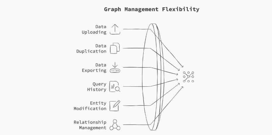
Simple, User-Friendly Graph Management
The browser also supports operations like uploading, duplicating, exporting data, and maintaining a query history. This is a key feature for developers and analysts working with evolving datasets. You can quickly modify entities, add or delete relationships, and visualize schema changes in real time. This flexibility makes it easy to adapt the graph structure to the changing requirements of AI applications or data-driven projects.
How to Visualize Knowledge Graphs Using FalkorDB Browser
Below, we will walk you through a simple example where we install FalkorDB, create a knowledge graph, and then explore it using the FalkorDB Browser.
As the first step, let’s install FalkorDB using Docker.
docker run -p 6379:6379 -p 3000:3000 -it --rm -v ./data:/data falkordb/falkordb:edge
Now, create a Python virtual environment, and install the FalkorDB Python client.
pip install FalkorDB
Now, we’ll create a simple Python script to build a graph and insert some nodes and edges.
					from falkordb import FalkorDB
try:
   db = FalkorDB(host='localhost', port=6379)
   print("Successfully connected to FalkorDB")
except Exception as e:
   print(f"Failed to connect to FalkorDB: {e}")

# Create the 'ECommerce' graph
g = db.select_graph('ECommerce Graph')
g.query("""CREATE
          (:Customer {name:'John Doe'})-[:purchased]->(:Product {name:'Laptop'}),
          (:Customer {name:'Jane Smith'})-[:purchased]->(:Product {name:'Smartphone'}),
          (:Customer {name:'Alice Johnson'})-[:purchased]->(:Product {name:'Tablet'}),
          (:Product {name:'Laptop'})-[:related_to]->(:Product {name:'Smartphone'}),
          (:Product {name:'Smartphone'})-[:related_to]->(:Product {name:'Tablet'}),
          (:Customer {name:'John Doe'})-[:friend_of]->(:Customer {name:'Jane Smith'})""")
You can head over to http://localhost:3000/graph to explore the graph (leave username and password blank). Select the graph from the dropdown, and click on Run.
Conclusion
Knowledge Graph Visualization is a powerful tool that transforms complex, interconnected data into comprehensible visual representations. By revealing hidden patterns and relationships, it enables faster, more informed decision-making across various domains. The FalkorDB Browser stands out with its ability to leverage the ultra-low-latency FalkorDB graph database, which can handle trillion-node graphs with ease.
To get started with FalkorDB and FalkorDB Browser, head over to the docs or sign up for FalkorDB Cloud.
